One Company. Multiple Identities.
The Flower Shop brought together a collection of cannabis brands, each with its own personality, audience, and point of view. From bold and playful to refined and understated, every brand needed a distinct visual identity while existing within the same retail ecosystem.
The creative challenge was bringing those personalities to life across packaging, photography, digital experiences, and campaigns, finding ways to stand out in a highly competitive industry with unique marketing restrictions.

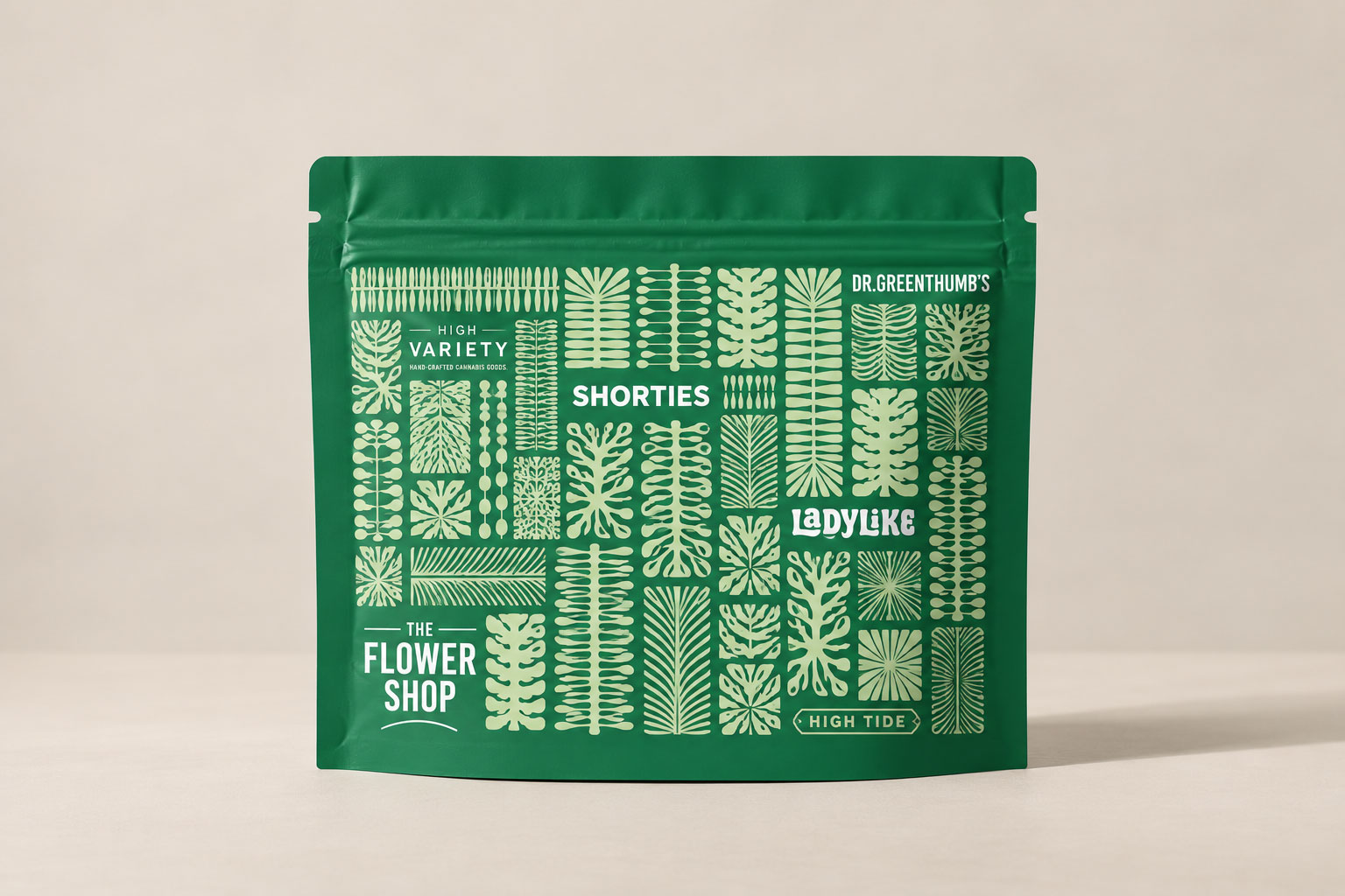
Developing In-Store Experiences
The in-store experience was an essential part of The Flower Shop's identity. From point-of-sale materials to the exit bags customers carried out the door, every touchpoint was an opportunity to reinforce the brand and create a consistent retail experience.
Bringing the Experience Online
The Flower Shop's botanical, trend-forward identity needed to translate into a digital experience that felt modern, elegant, and approachable. We balanced the brand's personality with intuitive navigation and a streamlined shopping experience, making it easy for customers to explore products and place orders online.
Making Our Presence Known
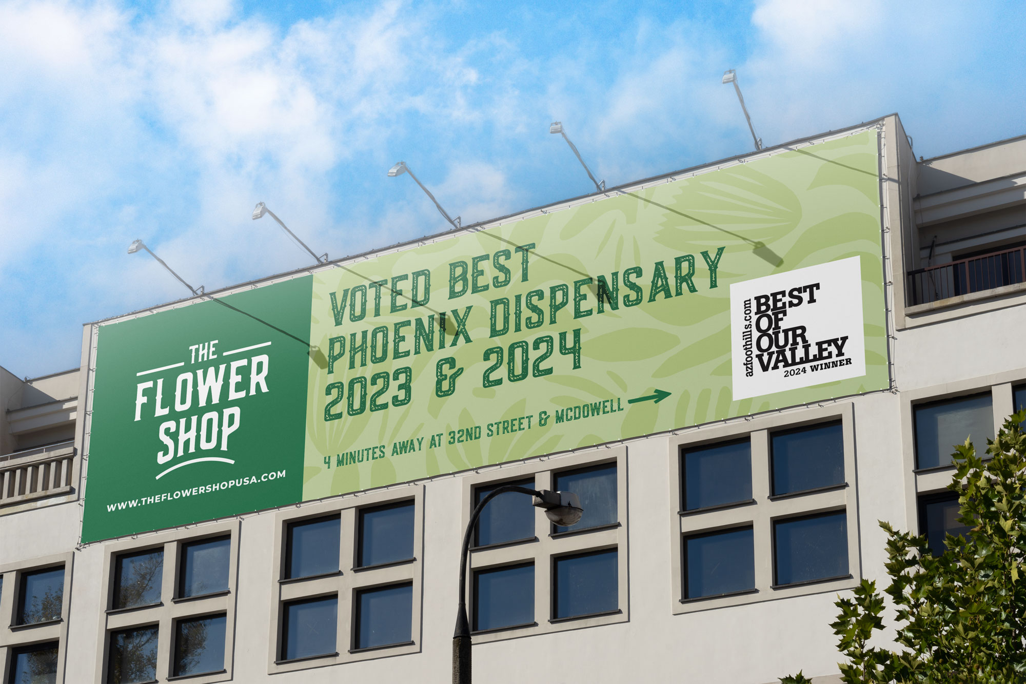
With strict regulations around cannabis advertising, out-of-home creative required a different approach. We leaned into proximity and social proof, using location-driven messaging and recognition like being voted Best in the Valley twice to build credibility and give customers a reason to visit.
Different Brands.
Different Personalities.
High Variety
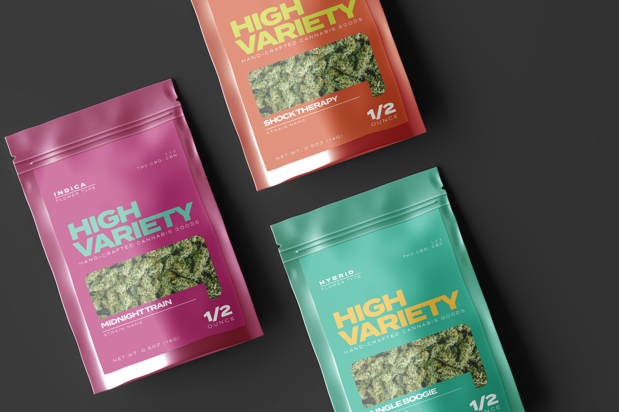
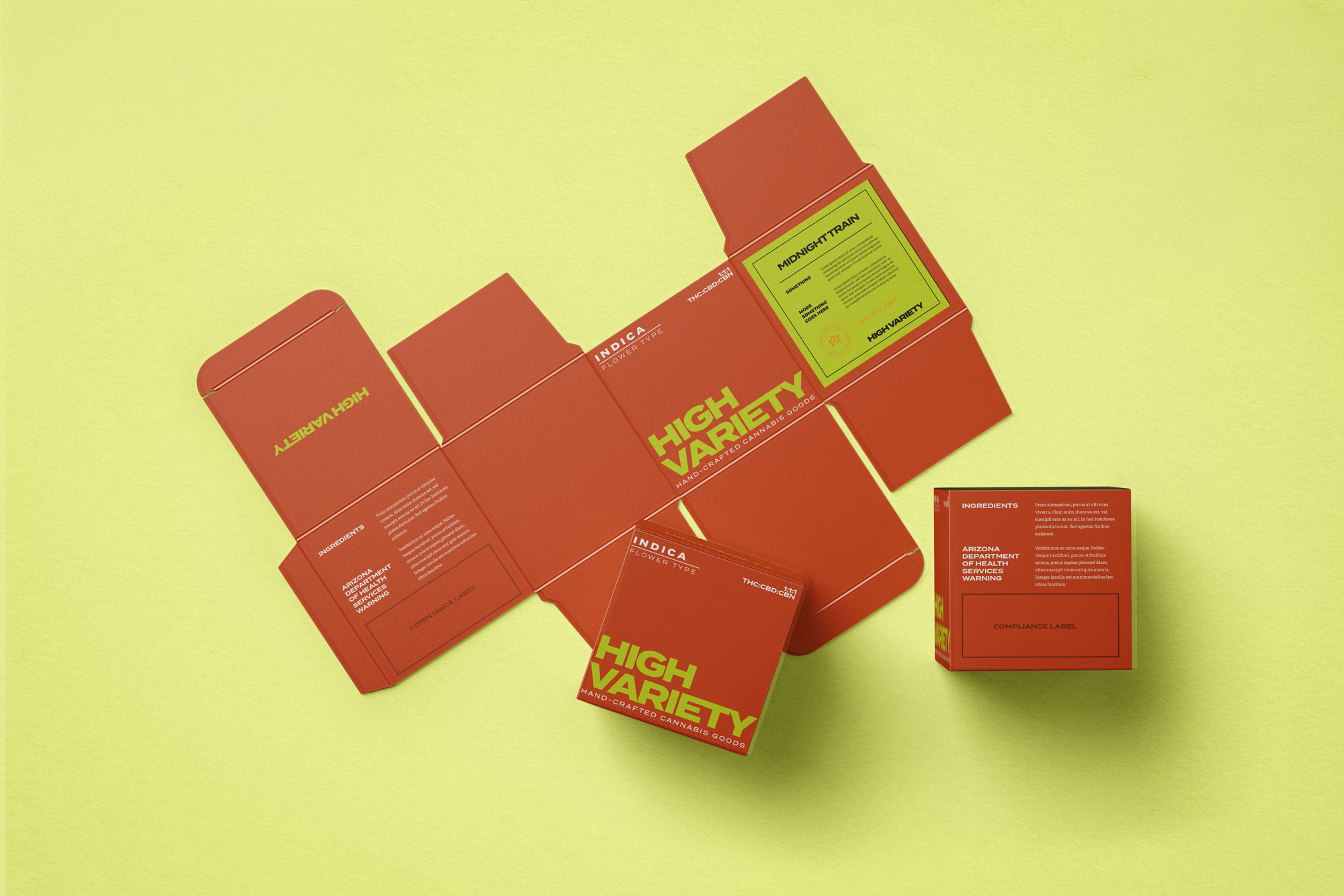
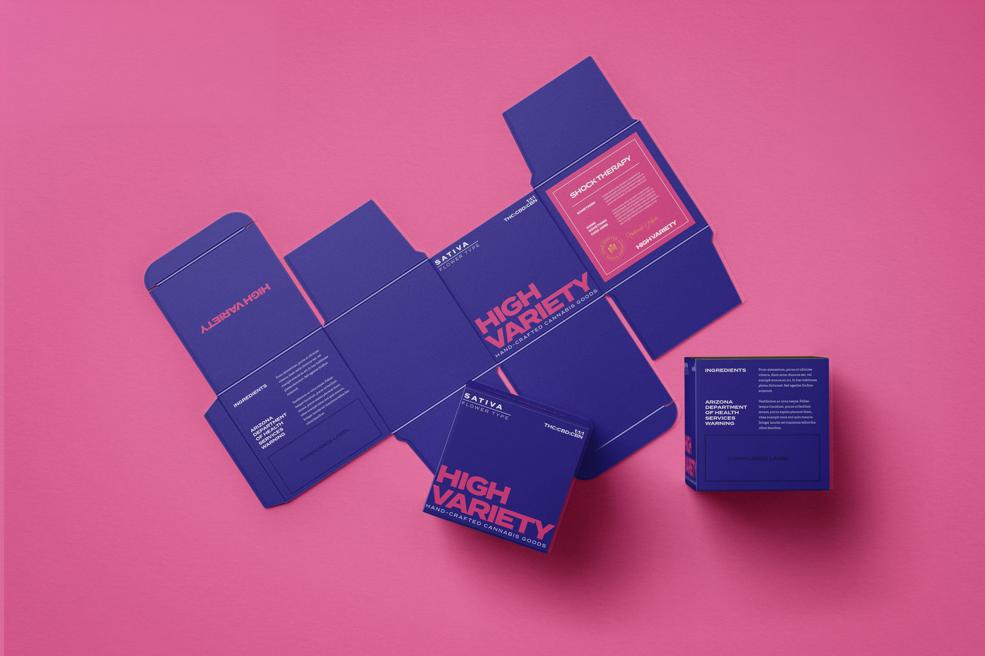
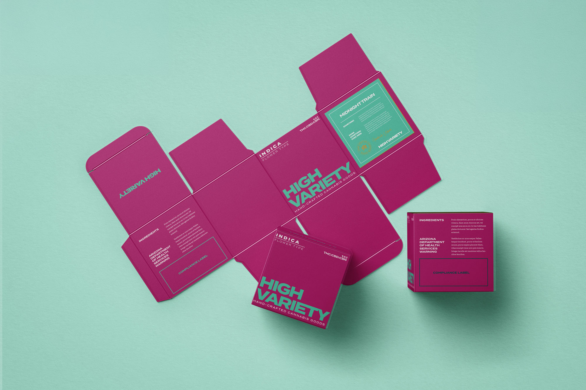
For High Variety, we explored a bold, typography-driven rebrand that moved away from a traditional logo. Instead, expressive type and a distinct color system became the foundation of the identity, creating a clear visual distinction between indica, sativa, and hybrid products.
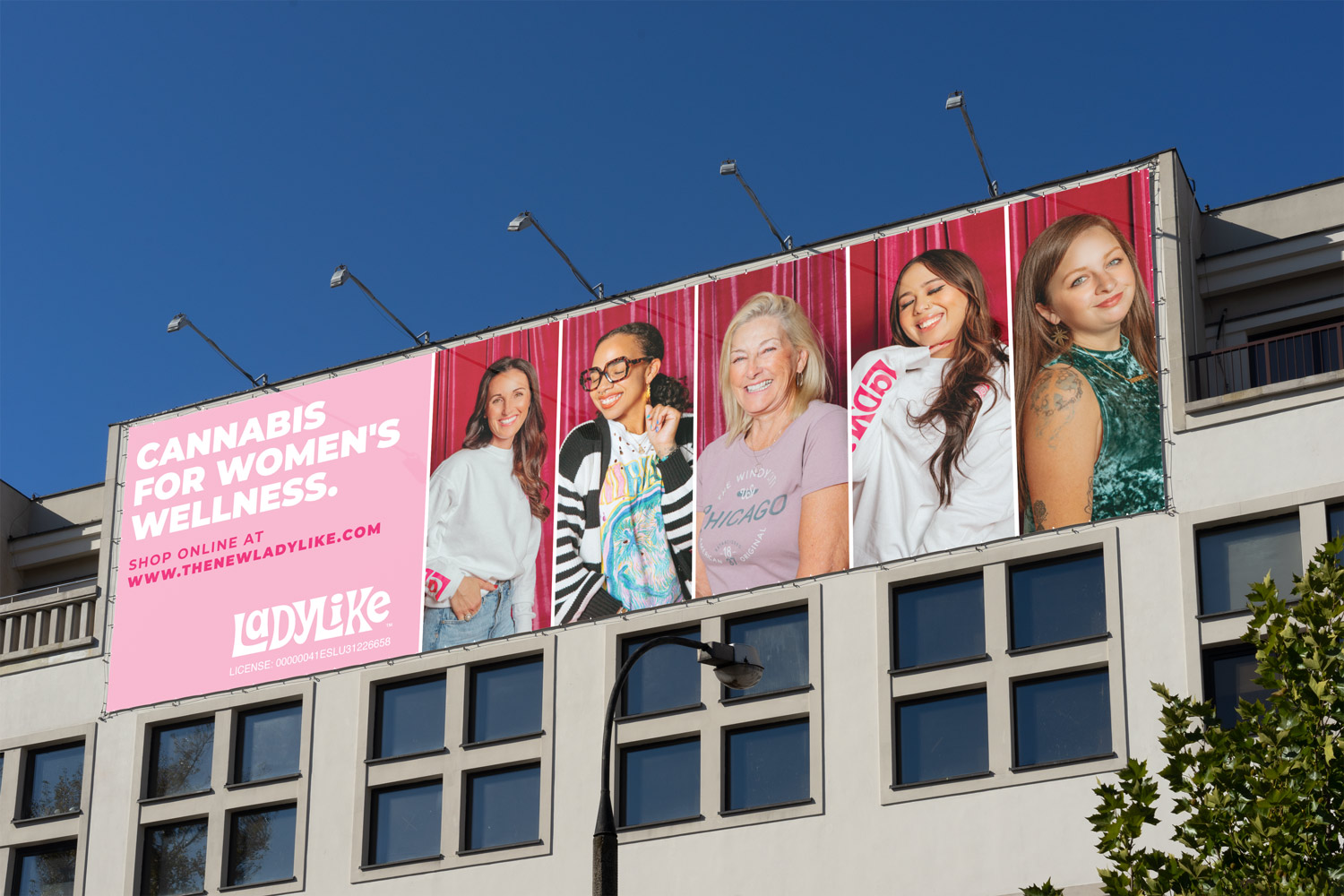
Lady Like
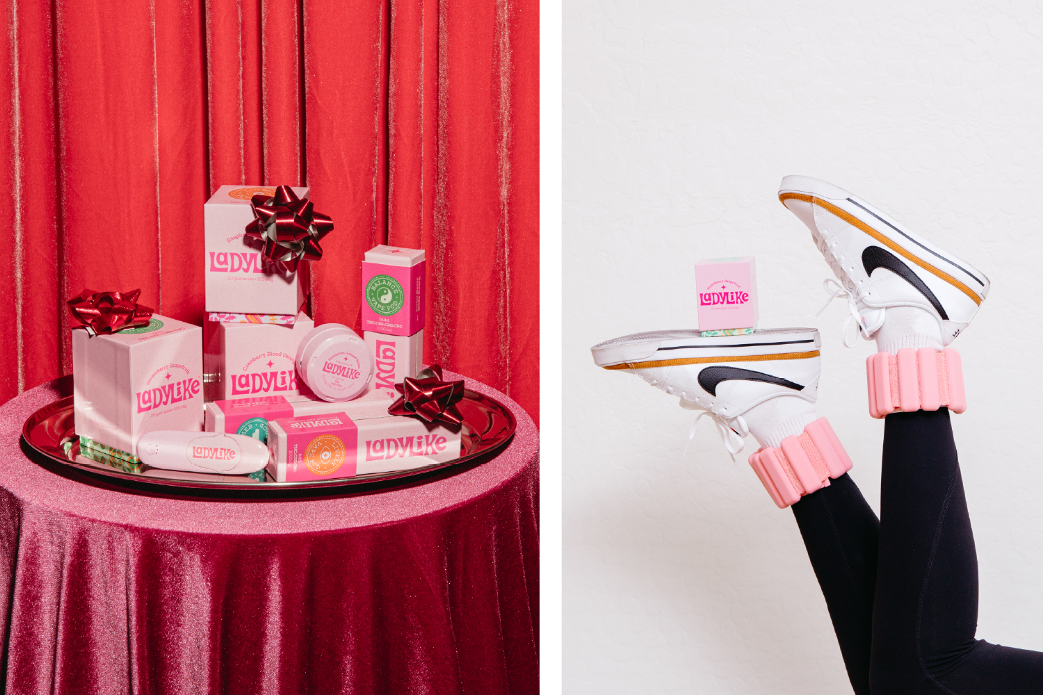
For Ladylike, we explored a lifestyle-driven creative direction inspired by women's health and wellness, bringing a more thoughtful, contemporary perspective to cannabis branding. The “Ladies of Ladylike” campaign brought that approach to life through testimonials from women sharing their personal relationships with cannabis, extending the brand's story into out-of-home advertising.
High Tide
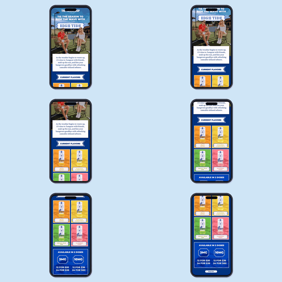
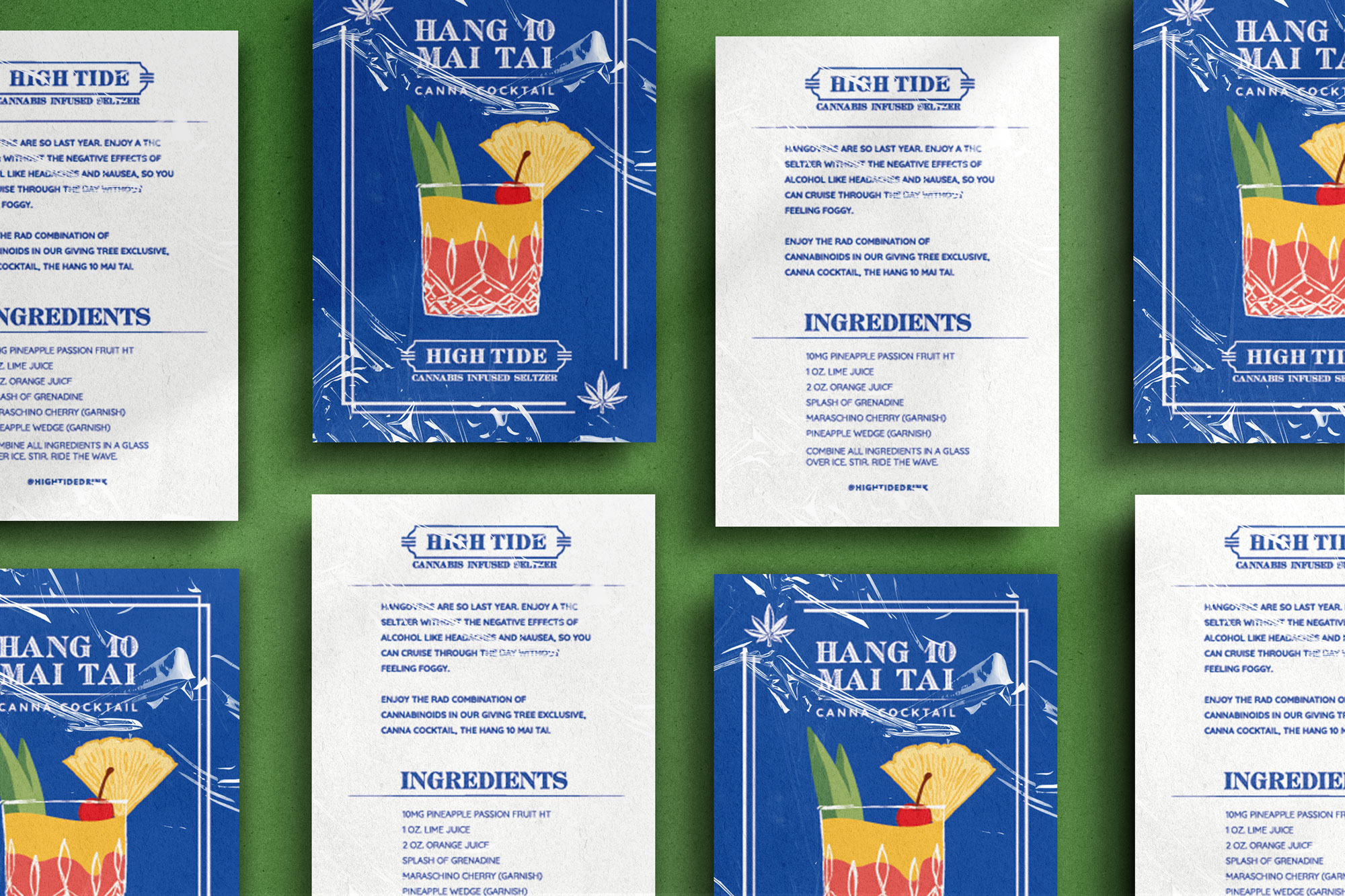
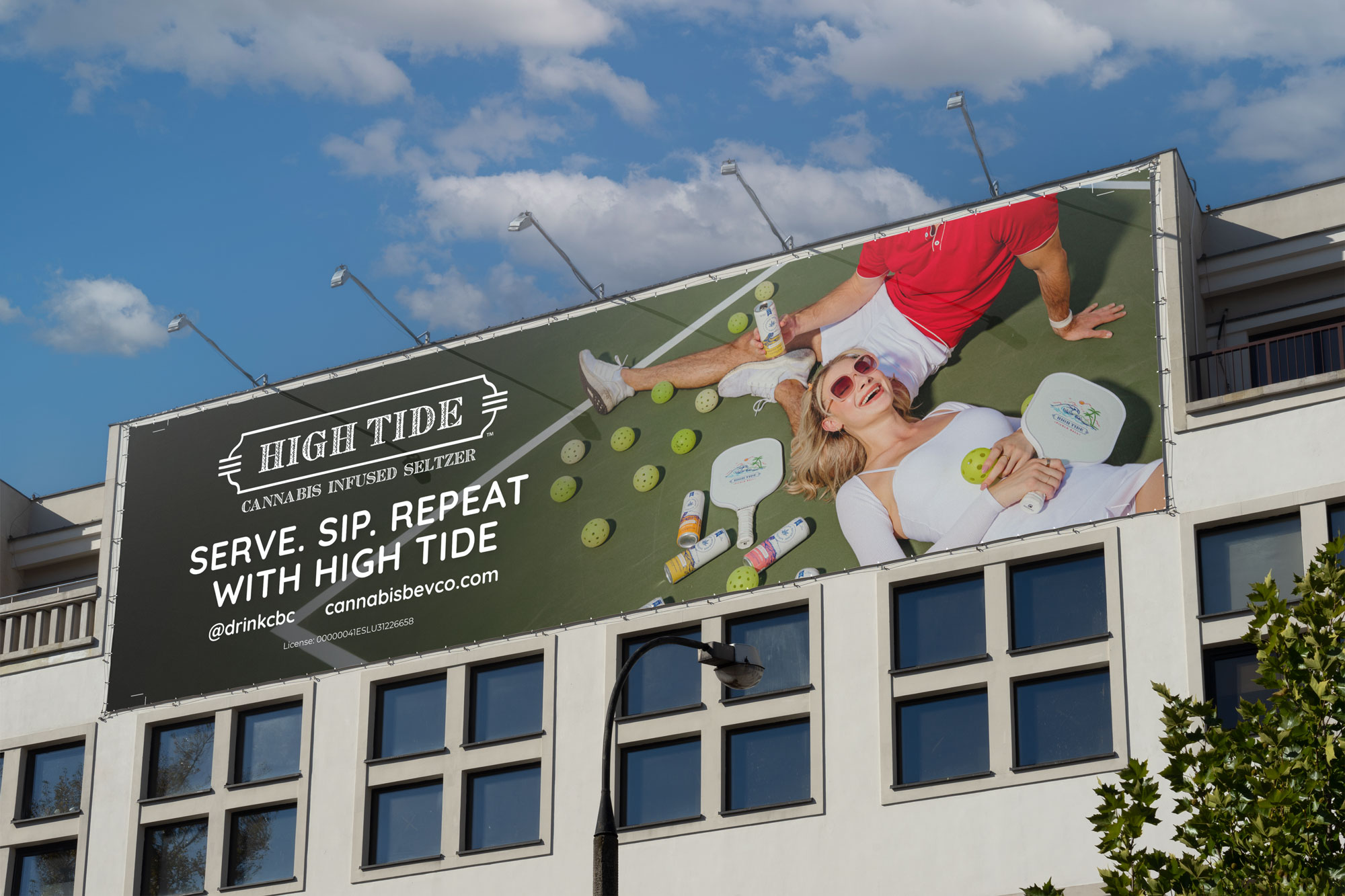
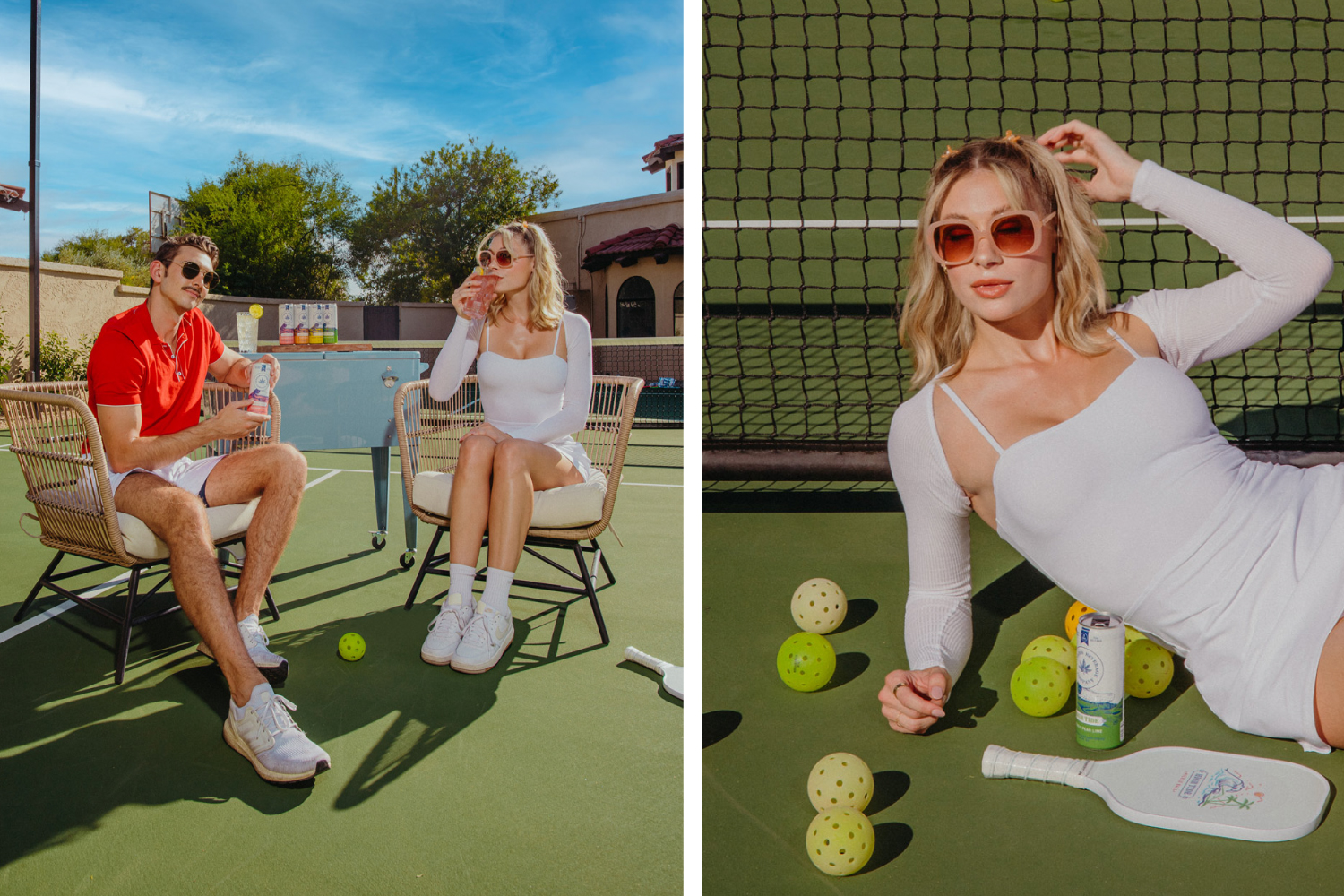
For High Tide, we explored a laid-back, lifestyle-driven identity inspired by the easygoing energy of brands like White Claw. A preppy aesthetic, playful visuals, and a fresh approach to art direction helped create a brand that felt casual, approachable, and effortlessly fun.
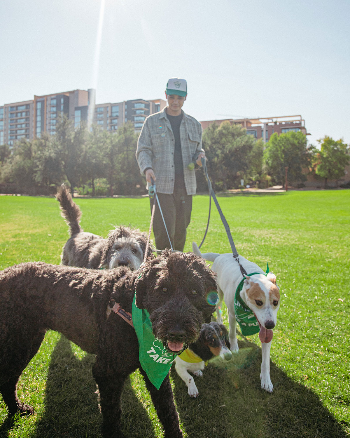
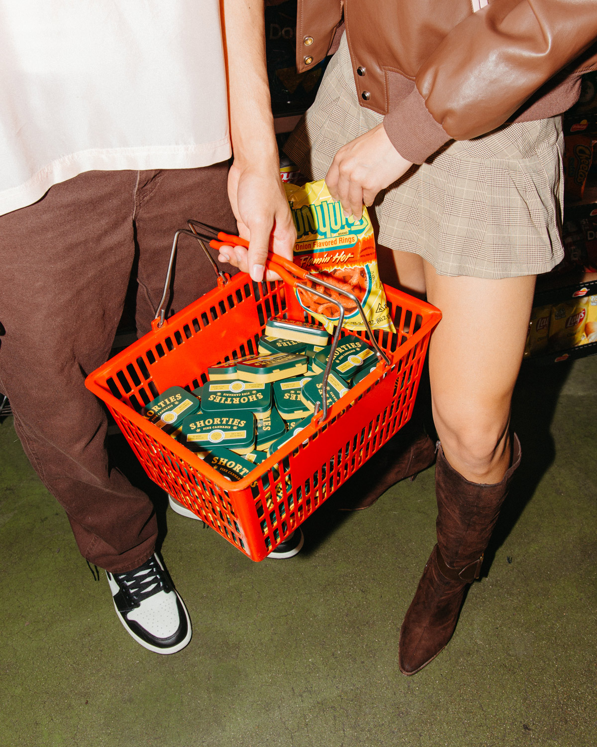
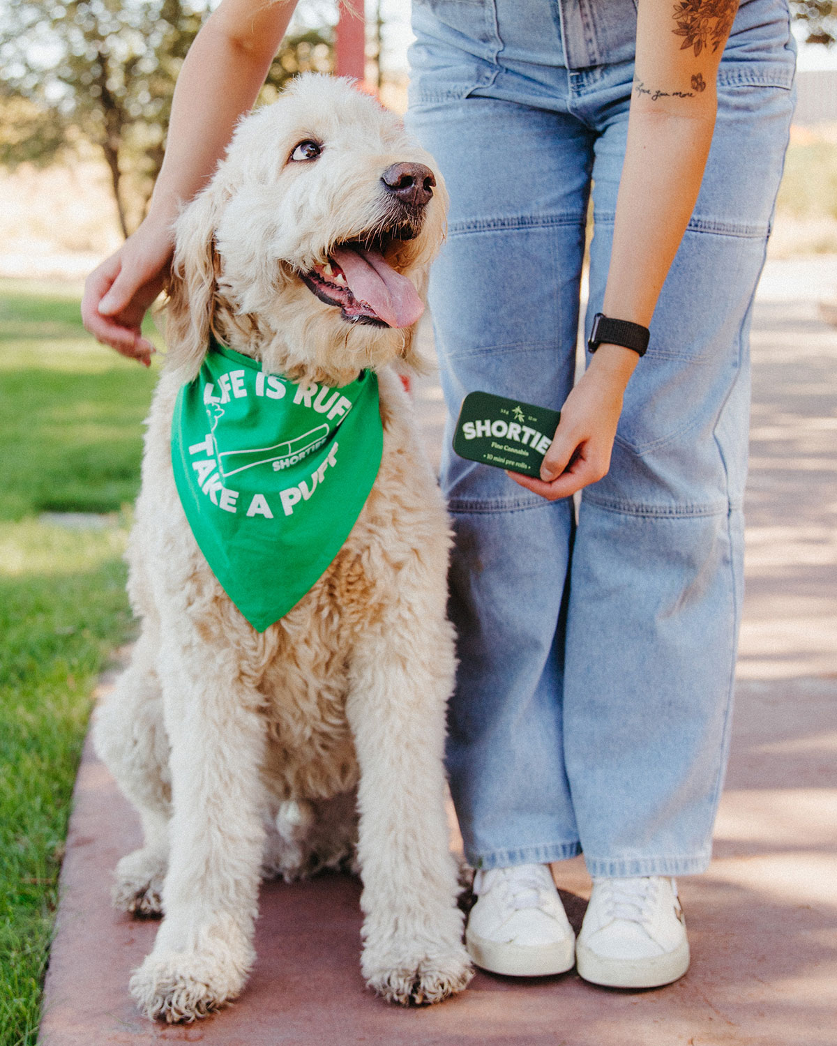
Rolling with Shorties
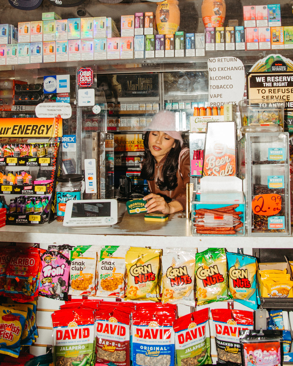
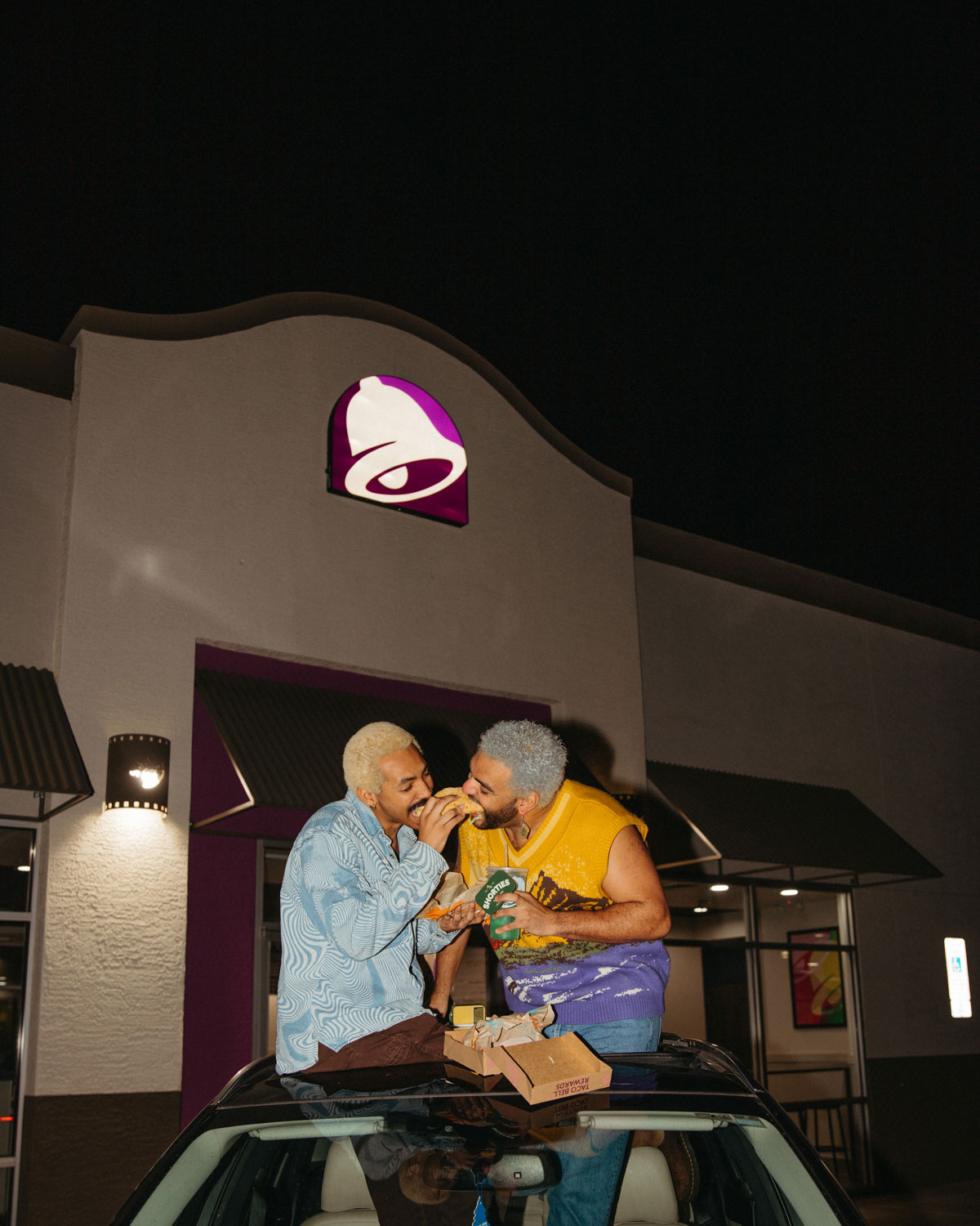
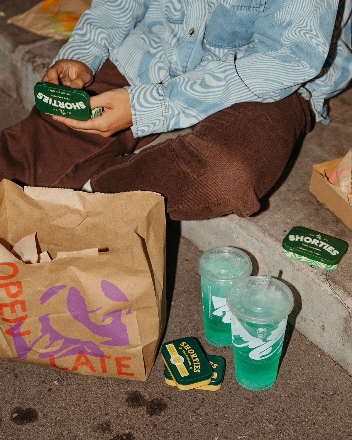
Built for a Gen Z audience, Shorties took inspiration from skate culture, pop culture, and an edgier, more expressive lifestyle. From collectible monthly strain-drop stickers to a playful dogwalker-inspired photoshoot for our 0.35g pre-rolls, the creative embraced trends and cultural moments while finding clever ways to tell product stories within cannabis marketing restrictions.
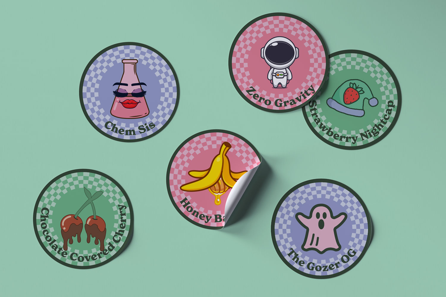
Monthly Strain Stickers
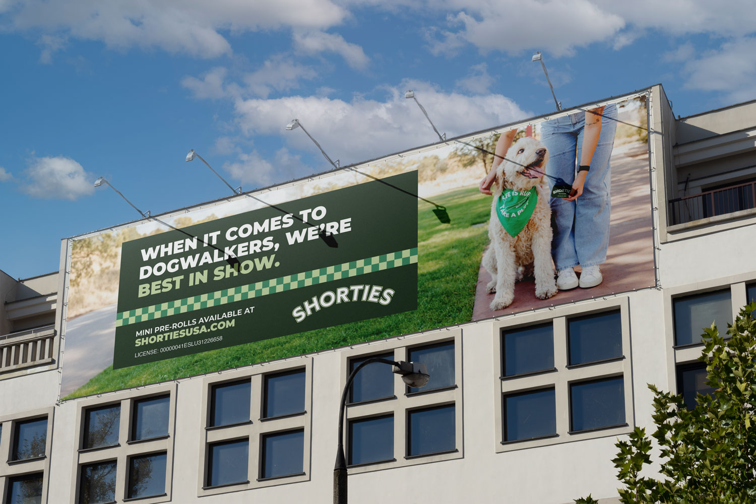
Dogwalker Billboard
Dr. Greenthumb's
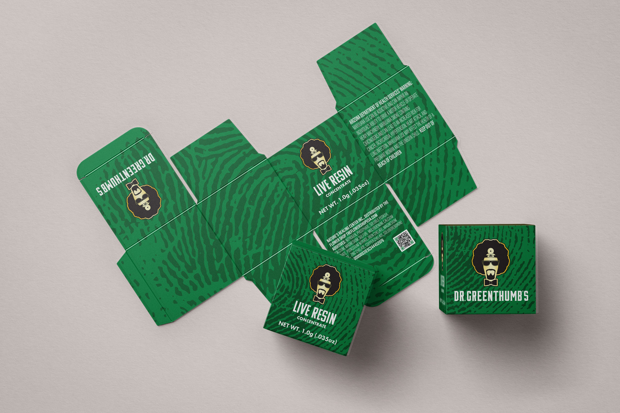
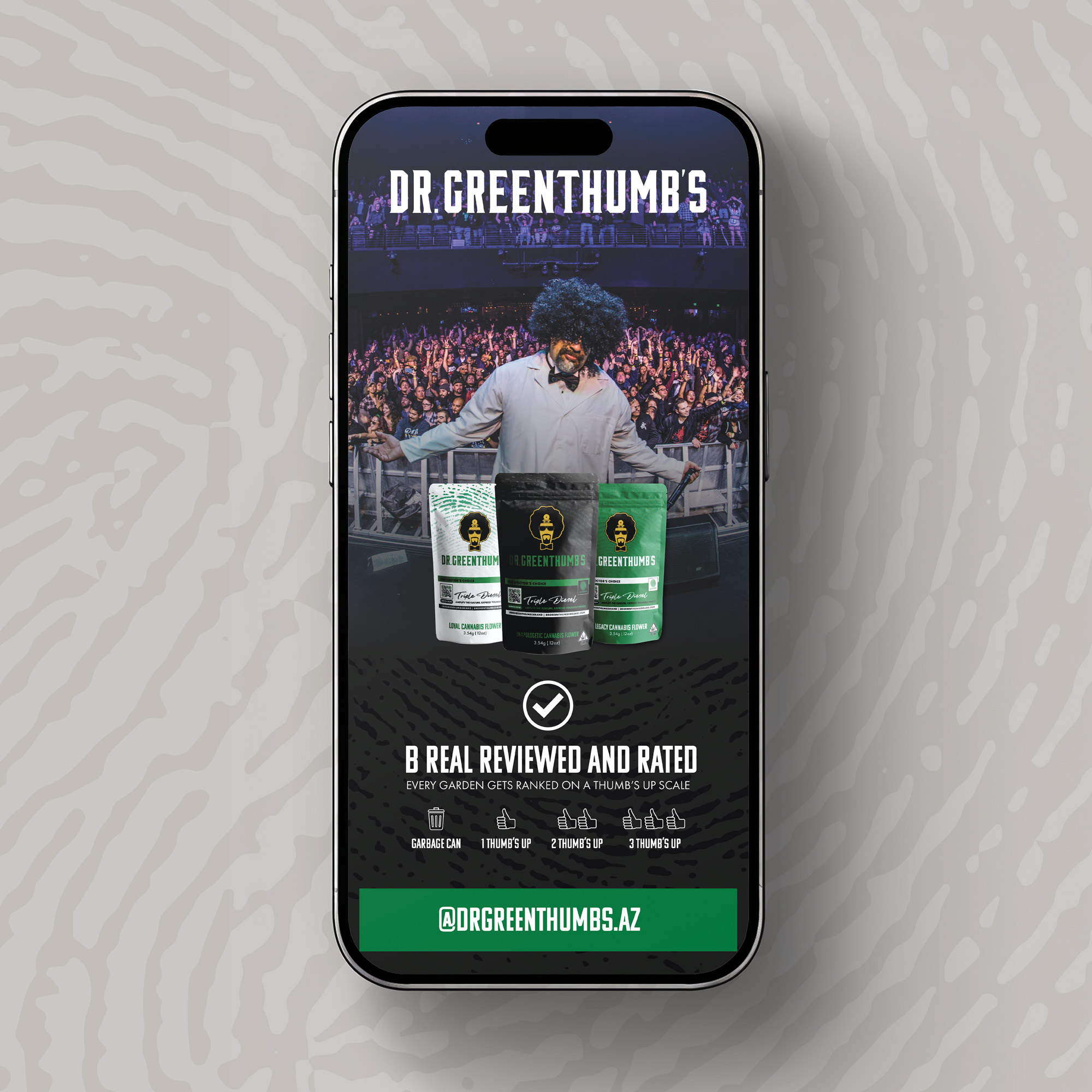
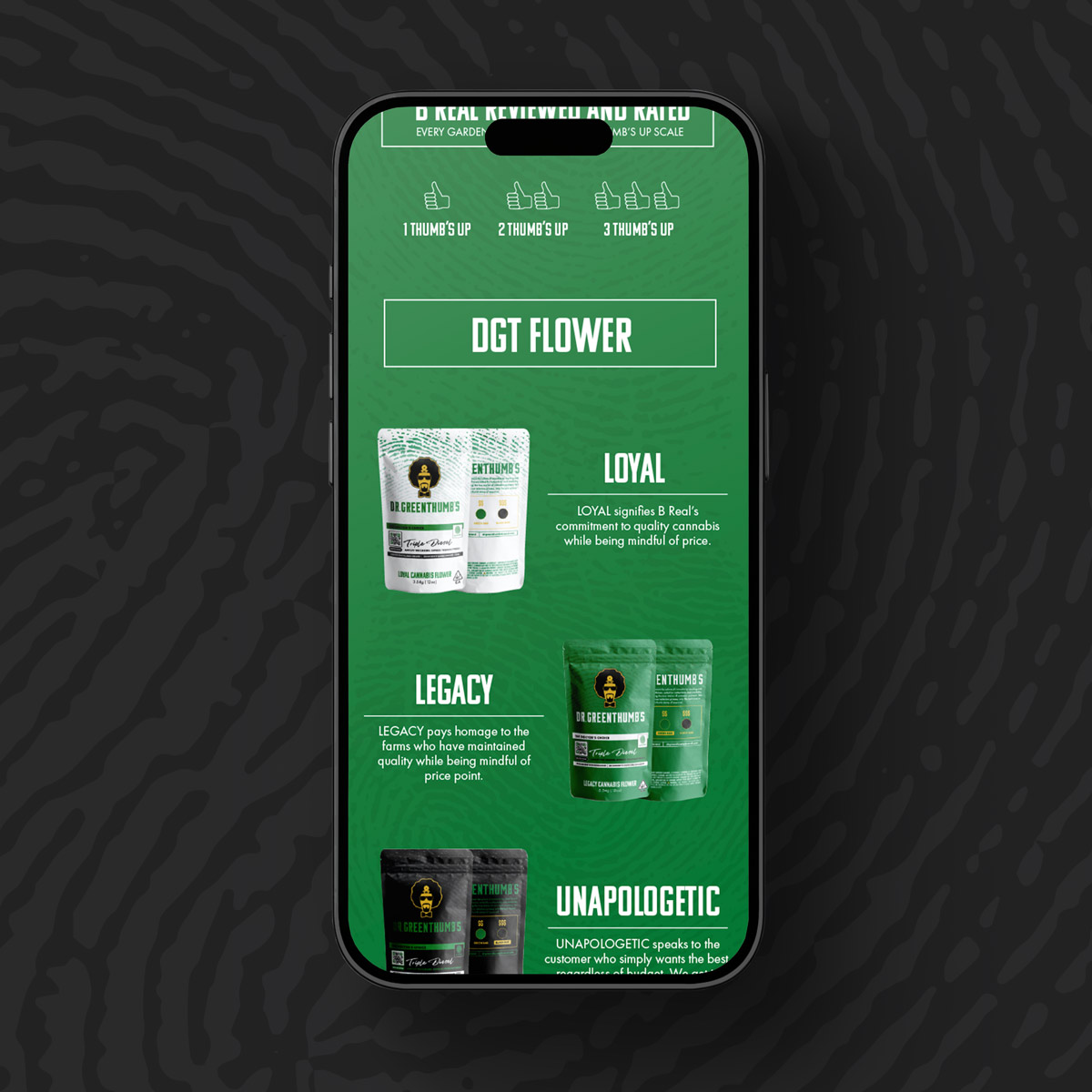
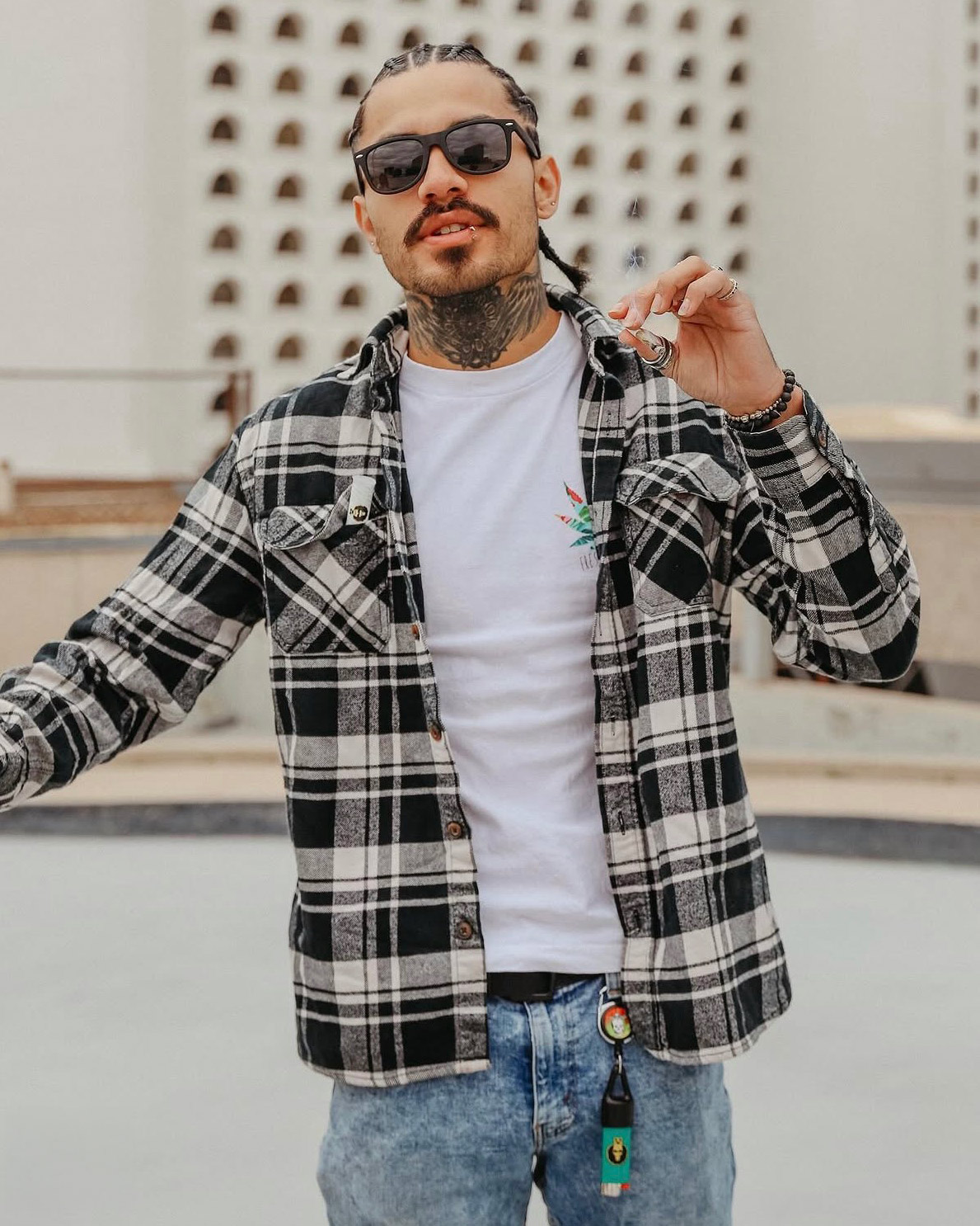
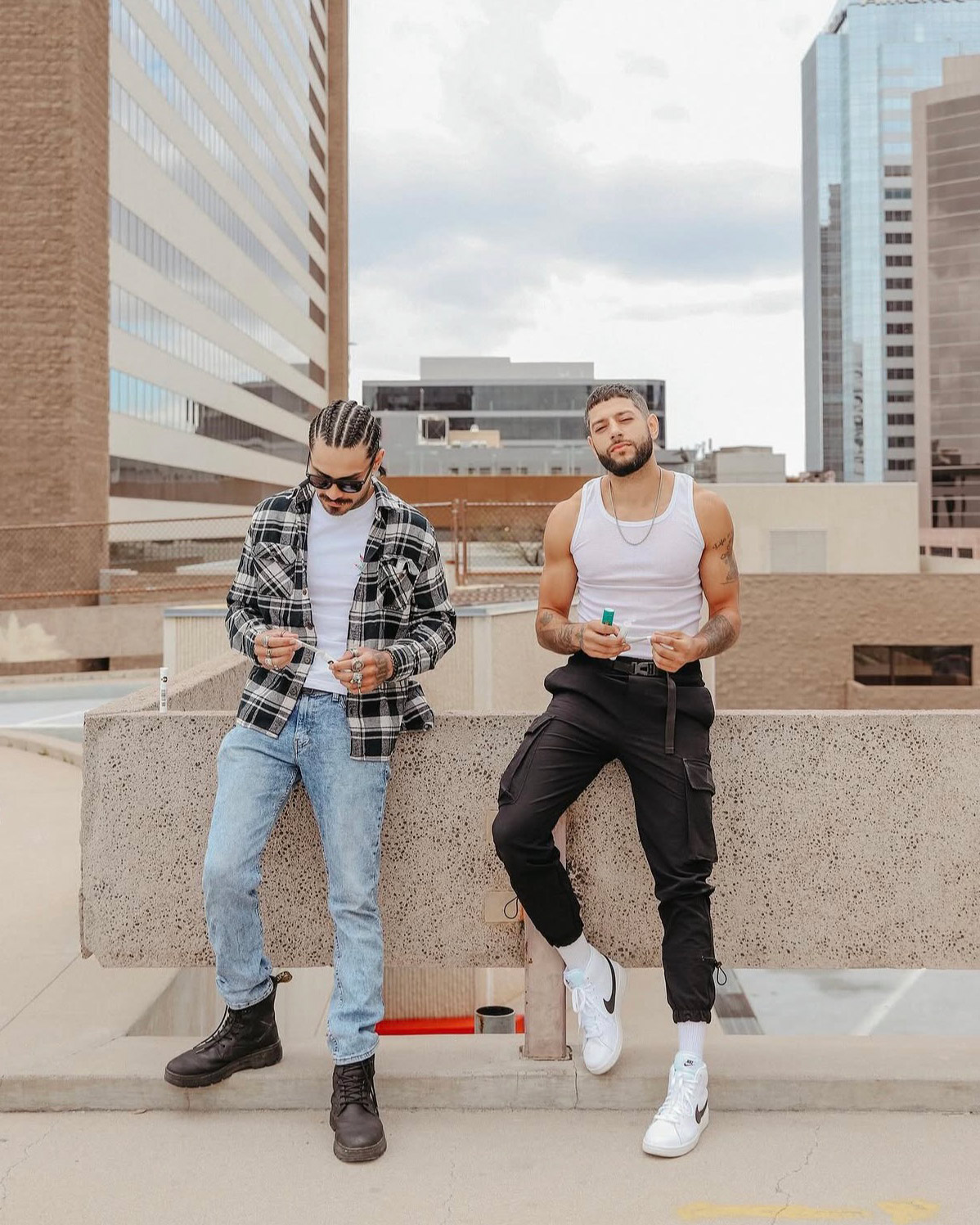
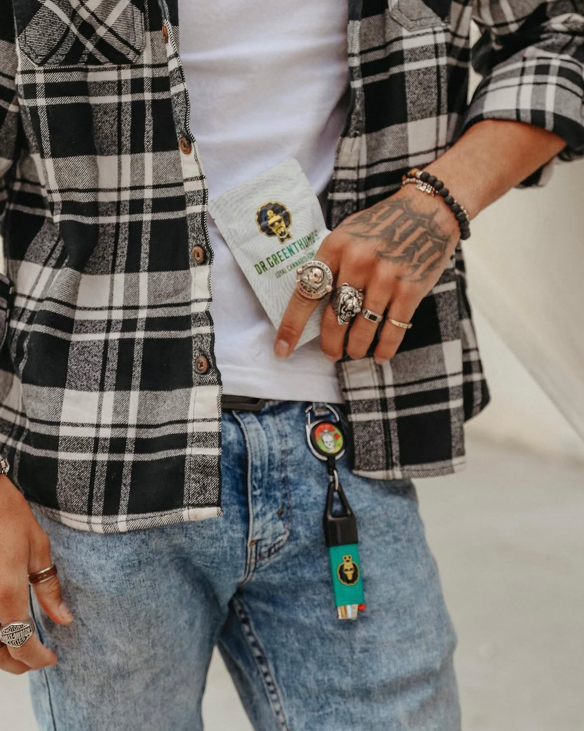
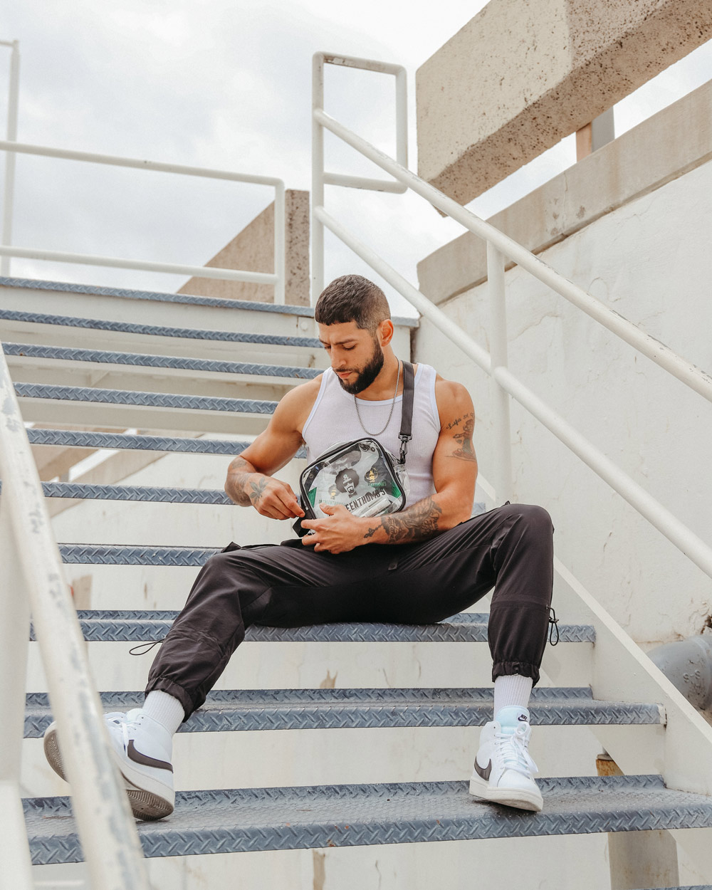
Bringing an established brand like Dr. Greenthumb into The Flower Shop's world meant finding a balance between two distinct visual identities. We blended elements of both aesthetics to create photography and creative that felt authentic to Dr. Greenthumb while connecting with The Flower Shop's audience.
420 Needed to Hit Different
For The Flower Shop's 420 campaign, we flipped the visual language of vintage anti-drug advertising on its head. Drawing inspiration from retro public service announcements, bold typography, and nostalgic graphics, we created a playful, tongue-in-cheek campaign that turned familiar anti-cannabis messaging into a celebration of cannabis culture.
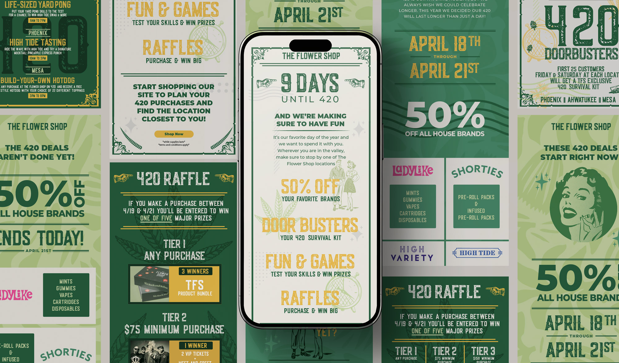
Standing Out in the Inbox
With every dispensary competing for attention during 4/20, our email campaign needed to do more than communicate deals. We leaned into bold visuals and attention-grabbing messaging to cut through the noise, keep The Flower Shop top of mind, and give customers a reason to shop with us.


More Projects
Agua BonitaProject type
Design ProjectsProject type

Adelante HealthcareProject type

PhotographyProject type
The Flower ShopProject type

Annual ReportsProject type
Dillon Ivory
Email: holler@dillonivory.com
LinkedIn: @dillon_ivory
© Dillon Johnson 2026 // Creative Director & Strategist